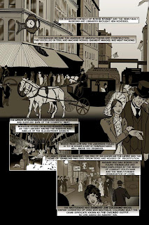
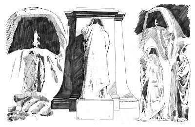
Color theory is an important element of art. When it comes to comic books, color has been used in several ways. In the early days it was used to bring excitement to crudely drawn images. In more recent years, it's been used much differently, especially since the invention of digital color and printing. I use color in many ways. For example, grey images are used for flashback sequences and montages.

I took color storytelling to another level in Visitations 3: Mayhem At The Levee. When the story begins the color is a greenish grey. This is meant to show that, not only is a flashback taking place ( since the story begins in the 1920's) but the unsavory side of Chicago is emphasized.
When the readers reach the infamous Red Light District of Chicago, known as the Levee, the colors of red, orange, and yellow are added to the dull green. These colors serve 2 functions: to make the streetwalkers stand out in an aggressive way, and to symbolize the color of Hell, emphasizing the sin that takes place in the area.
When we reach the bordello known as the La Plume Coloree, the story goes into full color. These colors skew red since we have fully entered Hell and a land of sin.
Once events start taking place in the cat house, the colors shift again, from a non-descript background color to deep red and black. This is meant to invoke aggression and danger as scary things begin to happen.
We then move to a flashback to the Great Chicago Fire and the colors are different shades of orange to represent the glow of the flames.
After the fire as the city, and Clawdia Byrd's relationship, cools the color shifts from orange to blue.
Color in comics can be representative of emotions and events. It is an essential element when it comes to telling a story. When using color it's important for the artist to not only think of what the world looks like, but what it feels like.


